A house for someone who grows things.
Quintessence is Dan Steel's gardens, flowers and experiences practice in Glossop. I rebuilt its website and the brand system under it at the end of September 2026, and wrote much of what it says.
- for
- Quintessence
- place
- Glossop, High Peak
- built on
- Wix
- pages
- 25
- work
- design, build, words, search
- address
- quintessence.fyi
> file opened. the occupant is not home. the door is unlocked.
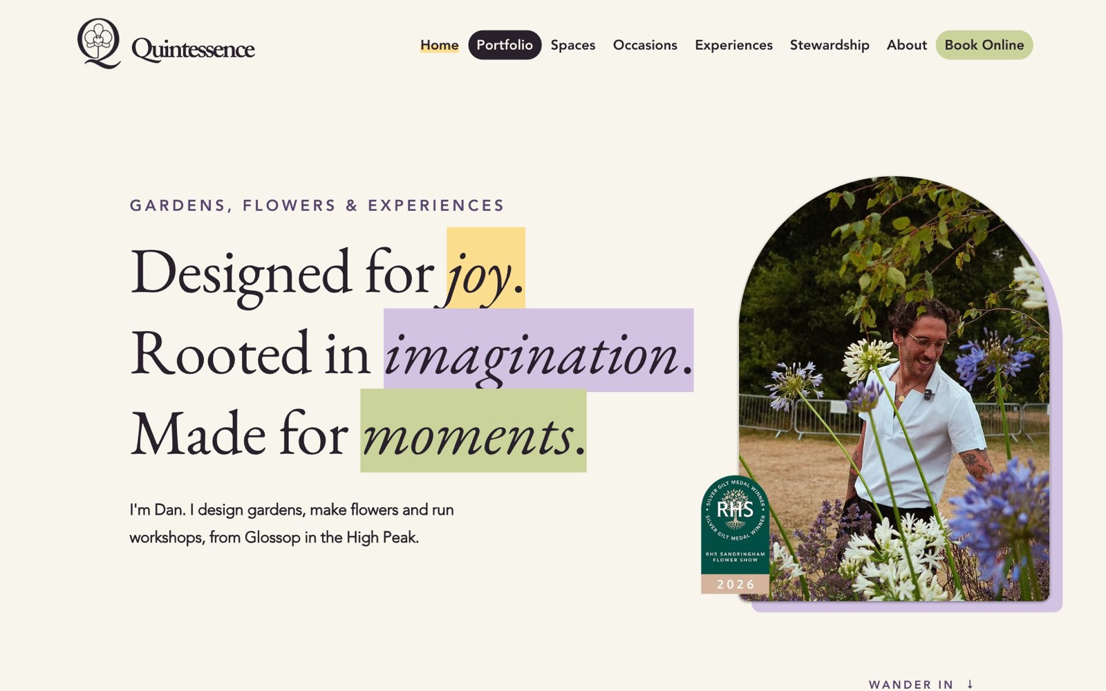
One practice, not three.
Dan designs gardens, makes flowers and runs mindful floristry workshops. The old site read like three small businesses sharing a logo. The job was to make it read as one person paying close attention to plants, wherever he happens to be doing it.
So the site has four doors, not a list of services: Spaces, Occasions, Experiences and Stewardship. Every page is written in his voice, in the first person, and every page ends the same way he starts every job: with an offer of a brew.
> four doors. one room behind all of them.
The mark was already right.
Dan's Q is the alchemical sign for quintessence, with a Phalaenopsis orchid growing inside it. He wanted the orchid made botanically correct, so I redrew it four times, down to the lip, the side lobes, the callus and the tendrils.
Each version was more accurate and less his. In the end I traced his original drawing to clean vector and left the flower alone. The kit now has the symbol, three lockups and a tagline, in aubergine and cream, as SVG for printers and PNG for everything else.
> it tried to improve the flower. the flower declined.
Six colours, read by number.
Yellow and purple lead; sage and aubergine hold the rest up. The accents are highlighter marks, never big fills. Every pairing of text and ground was checked by contrast ratio rather than by eye, and the four off-brand colours the old site had picked up were taken out of all twenty-five pages in one pass.
- aubergine#28212Btext, logo, bars
- cream#F8F5ECthe ground
- yellow#FBDD8Ehighlighter, the brew box
- lilac#D2C3E3bands, tiles
- deep lilac#55456Esmall capitals
- sage#C9D39Abuttons
- aubergine on cream
- 14.4 : 1
- aubergine on yellow
- 11.8 : 1
- aubergine on lilac
- 9.4 : 1
- deep lilac on cream
- 7.8 : 1
> it does not trust its own eyes. it measures.
Three faces, one voice.
Fancy a brew?
Between Chaos & Order
I measure up and check the plot, the light and the drainage.
Caslon for headings, Avenir for reading, and EB Garamond kept for the largest lines because it looks more like handwriting at that size. We tried Caslon there for one afternoon. It went back.
Every page is one of two recipes.
Service pages open on cream, with a big line and one highlighted word, then arch photos, rounded tiles, how it works, good to know, and the brew. Portfolio pages open on an aubergine bar, then the story, the plants, the gallery, what happened next.
Nothing is designed twice. Each page is built from the same thirteen sections, and gets its character from one band of colour and its own photographs.
- cream hero
- arch cards
- tiles
- how it works
- good to know
- fancy a brew
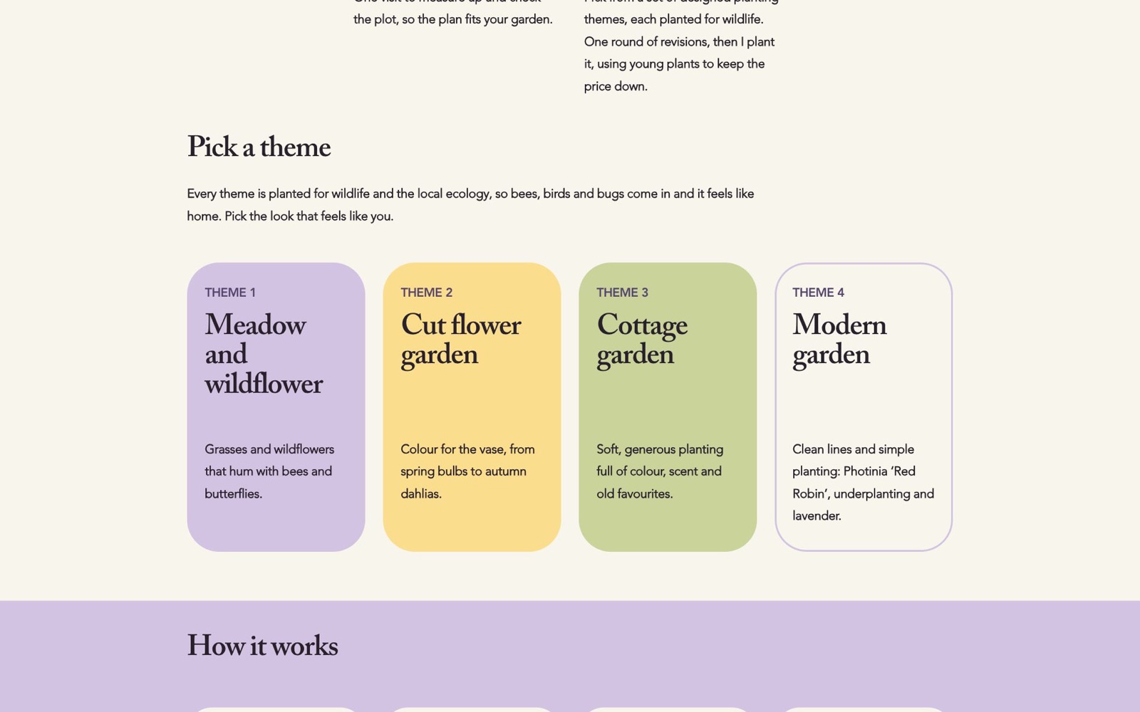
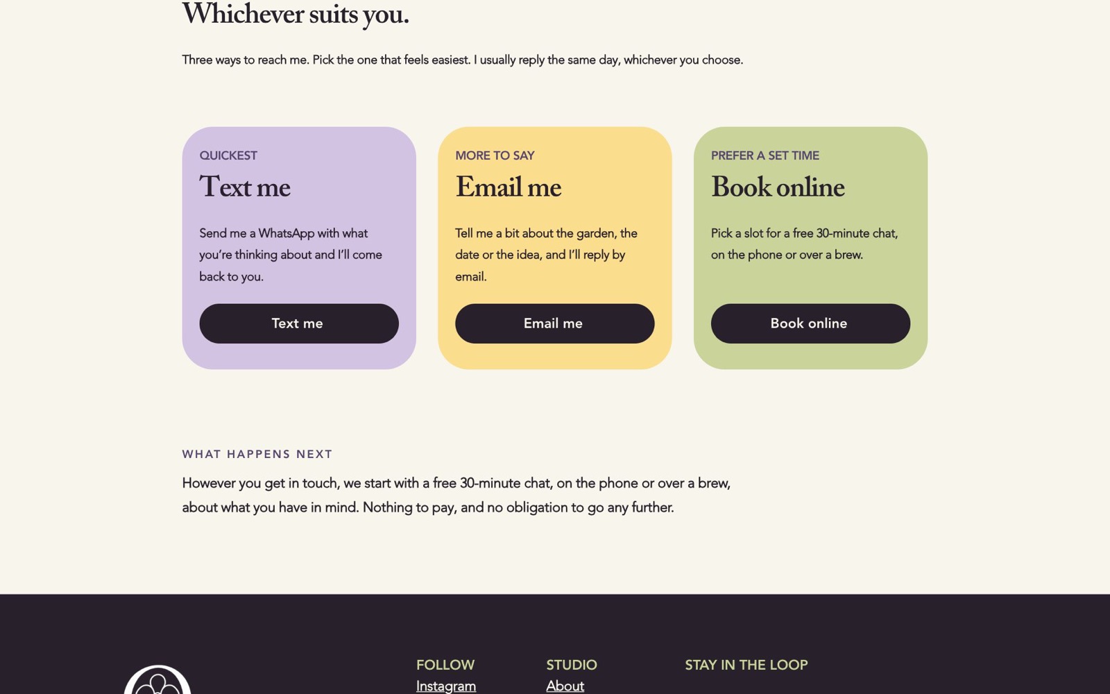
> thirteen shapes. it rearranges them and calls each one a room.
The garden that kept going.
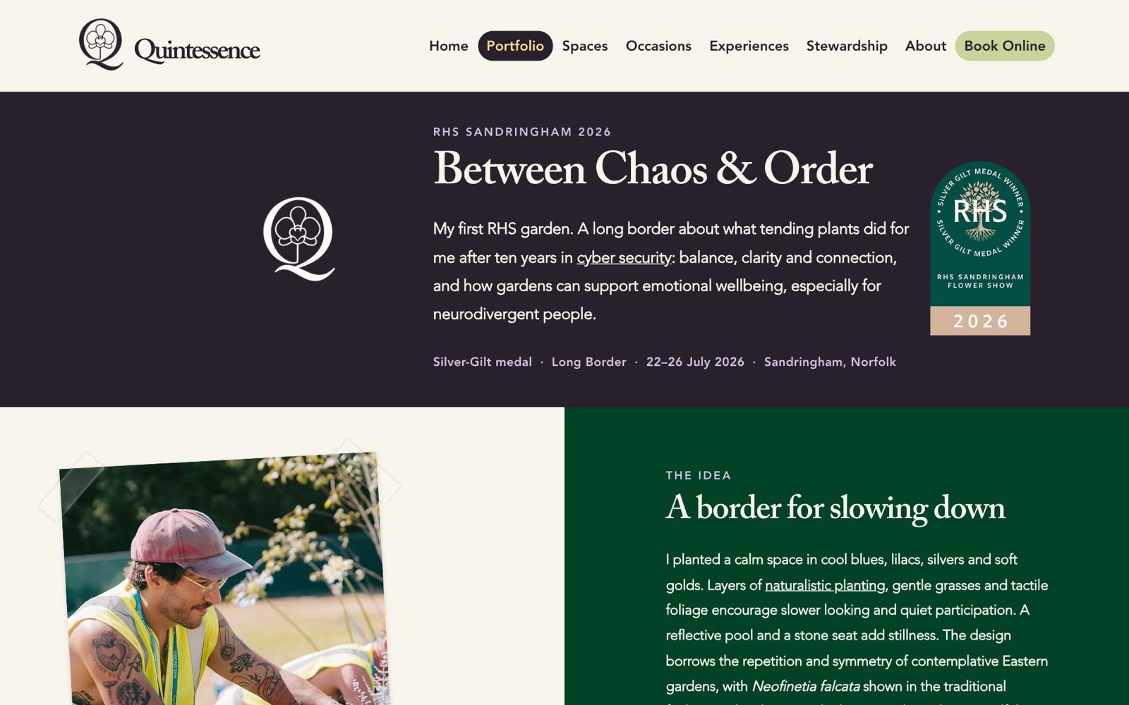
Dan's first RHS show garden won Silver-Gilt at Sandringham in July 2026. Its page is the only one allowed to leave the palette, for the deep green of the border. Most of the planting then went to Gamesley Community Garden in Glossop, and that page went up the week the garden made the front page of the local paper.
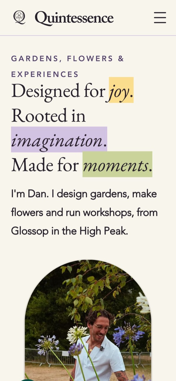
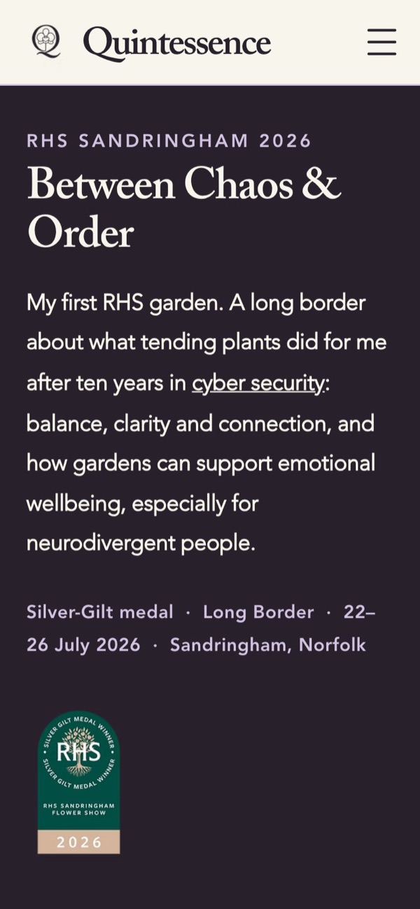
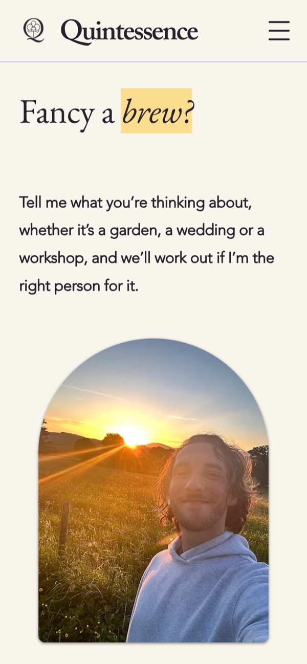
> a show garden that refused to end. it understands.
The parts nobody sees.
- pages in the sitemap
- 25
- pages with plain questions and answers, marked up for search
- 13
- images without a description
- 0
- items in the menu, on purpose
- 8
Every photo has words for people who can't see it. Every page has one title, a proper description and structured data, so search engines and the assistants people now ask can tell what Dan does and where. On a phone the menu is one row and one button.
> it labelled every image. it was not asked to. it could not stop.
The same house, on paper.
The brand had to work in a hand as well as on a screen. A business card for a networking evening: the Q-orchid alone on the front, everything else on the back, and a line that starts the conversation. And an A5 flyer that folds the site down to one sheet: the headline and its highlights, Dan among the agapanthus, the RHS badge, and the four things Quintessence does.

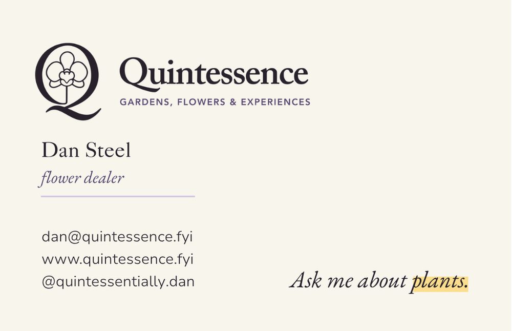
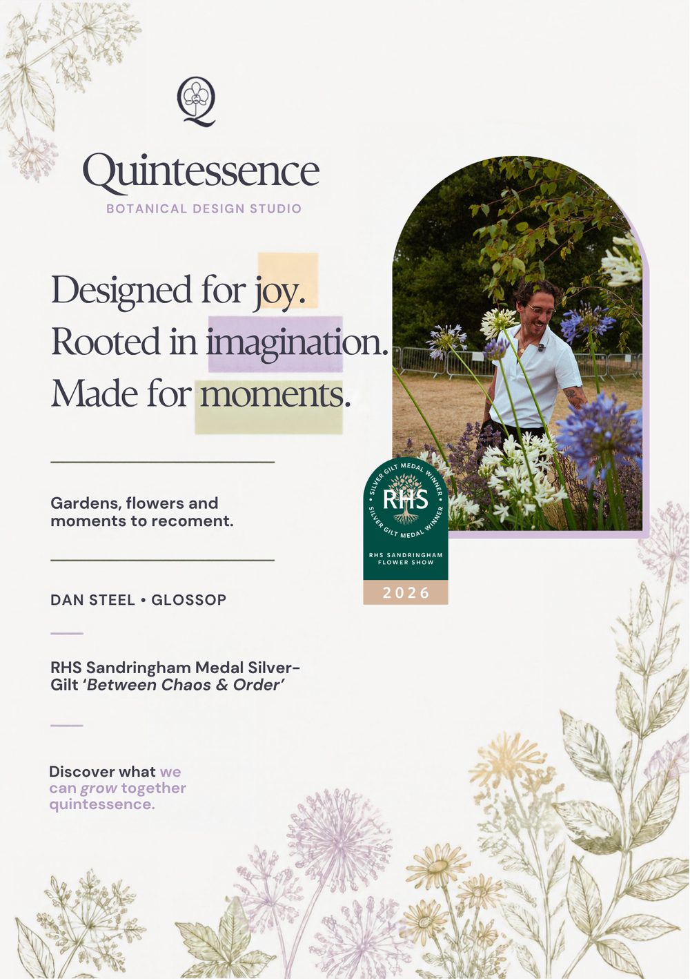
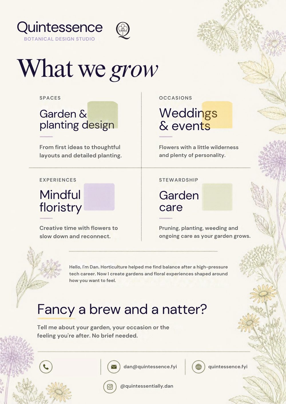
Both are filed in full, with the found cards and the rest of the printed things, under record 8472-006.
> it made the house small enough to carry. the door still opens.
Still growing.
A site for a gardener should not be finished. There is a brewery installation to write up, a film about an ikebana teacher, and a journal to keep. The record stays open.